By Adam Bailey
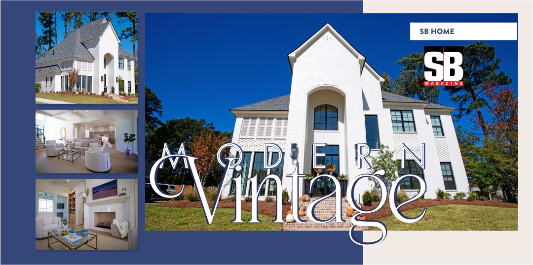
With stunning curb appeal and carefully curated design features, this custom build by renowned Nashville builders, Castle Homes, is a serene sanctuary. Take a peek at this gorgeous St. Charles Place retreat!
As co-owner of the oldest antique shop in Shreveport—King’s Antiques and More—Lauren has been exposed to a wide variety of design trends. As such, she has also gained interior design knowledge and inspiration as co-owner of Closets in Order—a company specializing in custom storage solutions—where she has spent countless hours working with clients and customers. Being a part of both companies has helped in developing her own distinct style. Recently, Lauren and her husband, Brad, a real estate developer, decided to construct a new house to fit their family-friendly lifestyle and slower pace of life.
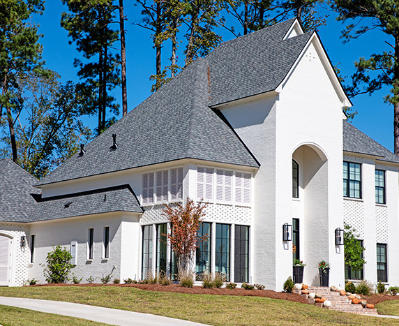
Sharing a love for contemporary architecture, the couple designed a modern, yet vintage, 4-bedroom, 3.5-bathroom home that measures just over 3,700 square-feet. This new-build perfectly fits into the aesthetic of South Shreveport’s Long Lake Subdivision. Local homebuilder Wimberly Custom Homes, LLC set the stage for the couple to shape spaces that harked to their past as they live for today. Simple yet ornate, layered yet uncluttered, airy yet spiced with drama.
“The ‘modern vs. vintage’ backdrop was a huge design element to work from, but I tried to make the space feel homey and comfortable by adding vintage elements to build on our style and warm it up inside,” Lauren recalled. “Those elements helped create the essence of the architecture.”
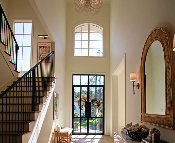
The home, which Lauren and Brad share with their 16-year-old daughter, Chloe, showcases a neutral, serene palette. Color is used subtly, and most of the furnishings are locally sourced from the Shreveport-Bossier area. To put it simply, old-world style and traditional architecture transform the spaces using wood flooring, coffered ceilings, and graceful furnishings. But modern sophistication lives comfortably here, too. For example, the 22-foot ceiling in the entry features a gorgeous, whimsical chandelier made of wood and iron—instantly transforming the space.
“The architecture is so beautiful. It’s a European-inspired project with contemporary details,” said Lauren. “And it’s all about juxtaposition. Brad and I wanted to emphasize the play of light and shadows through doorways and other structural details—emphasizing indoor-outdoor connections, with views into the outside.”
That sentiment jibes perfectly with the vision the couple had for their new home. “I like sleek, minimalistic and ultra-modern,” she said. “However, I wanted to incorporate an old-world style with modern details in our home. I wanted that warm old-Europe feel.”
As you gaze upon the home’s exterior, the layered brick adds character and sophistication, and stone pavers add charm and warmth to the intentional landing space it provides. Arched shutters add another layer of dimension that bows to the grandeur of the exterior’s architectural elements and offer respite from the scorching Louisiana sun, providing texture and charm. Timeless and elegant, the front porch has 6-Lite Steel Double Doors, allowing natural light to enter the structure, creating an amazing entryway that never ceases to amaze.
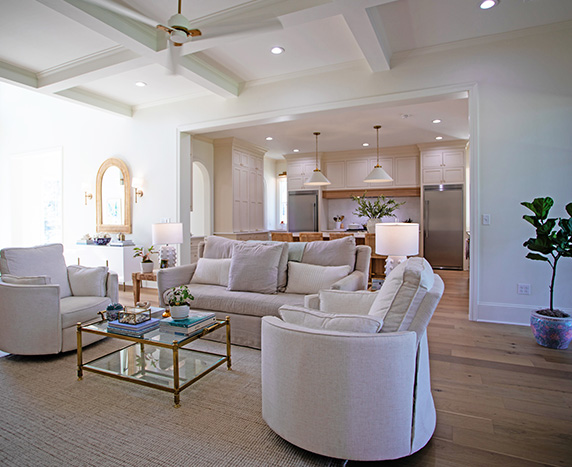
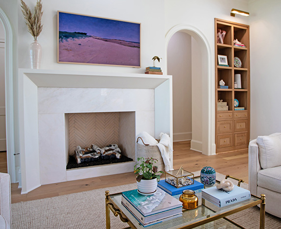
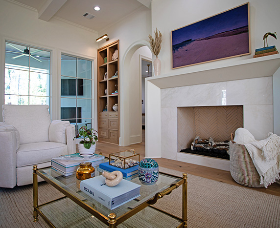
Lauren’s favorite part of the home is the open floor plan on the lower level. For the living room, the ceiling drops to 10 feet with a beautiful architectural detail of a coffered ceiling treatment—creating an intimate space with depth and character. She designed eye-catching custom millwork for the built-in shelves in the living room to bring energy to the room. “When designing this space, I knew I wanted traditional built-ins to help frame the space.”
Another charming feature is the arched doorways that frame the fireplace. The mantle and white Rhino marble surround bring the room a soft, modern element. The creamy herringbone tile detail inside the fireplace with the white birch logs is fantastic!
“The living room is bright and open to see into the kitchen—which I believe is the heart of the home. When we decided to build a new home, this is where our design started. We were intentional with creating a space that would be a warm and friendly gathering spot.”
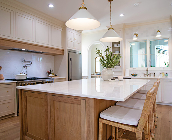
A spacious island with bar seating allows guests to hang out while cooking dinner so the host is not isolated from the group. Rattan bar stools add a touch of coastal inspiration and texture in such a clean, classic space. The kitchen cabinetry is a creamy, neutral color. All kitchen cabinets and drawers are a custom inset design, which helps create clean lines, add character, and help create a timeless, historic look. All kitchen hardware has an unlacquered brass finish that will add character over the years as it naturally patinas.
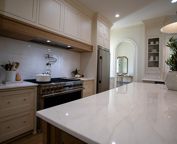
The kitchen countertops, butler’s pantry and bourbon bar are all in Bianco Rhino polished, marble. Bianco Rhino is sourced from Namibia, Africa—and is such a beautiful addition to this dreamy white kitchen offering a soft white veining that cannot be found with man-made surfaces.
The floating shelves in the butler’s pantry are elevated—adding interest and character using antique unlacquered brass rails. Adding to the light and airy flow throughout the home, even the butler’s pantry has a small window letting in more light. A beautiful white quartz sink and the Victorian bar faucet from the Kohler Artifacts collection add a lot of character to this dedicated space.
To help ‘elevate’ the island and range, Lauren chose white oak for the oversized kitchen island and a modern white oak beam above the 48” double oven. Brass knobs offer a cleaner, more appropriate look to the classic kitchen—combining modern design together with traditional features. The gleaming stainless-steel finish is set off with solid brass accents and wide glass windows with rich, interactive LCD displays.
To make the stovetop wall a beautiful feature, Lauren separated the freezer and refrigerator to keep symmetry throughout the back kitchen wall. A polished nickel pot filler offers a stunning and timeless effect—popping against the white Rhino marble stovetop backsplash.
Another popular area is the outdoor dining area off the back of the house.
“We have an outdoor dining space with two big windows that open to the kitchen,” said Lauren. “They are often open to create an indoor-outdoor feel. We love having friends over and hanging out on the patio, especially now that it’s fall, and can watch LSU football.”
The dining room offers an overabundance of natural light—in the best ways. With wall-to-wall windows, it’s beaming with brightness and gives a light and airy vibe. The Tulum chandelier creates a natural, effortless style. Its hand wrapped with rattan on elongated arms, perfectly paired with crisp, white shades and hints of matte brass for a casual-chic look.
Upstairs carries on the “neutrals with pops of color” theme but in a more intimate, softer setting.
Vintage items add an edgy glam element to the interiors—as it is evident that Lauren and Brad love pattern and texture. It’s a mixture of ornate details and simplicity in a way that feels collected over time.
Lauren and Brad also saw beauty through nature’s eyes, bringing in a palette inspired by outdoor views. The open floorplan easily allows light to flow through the tall windows, casting light and shadow against the tranquil neutral-colored walls. “We wanted to create a serene and calm open concept design with lots of natural light,” claims Lauren. “Using as many windows as possible helped us achieve this goal.”
Engineered hardwood floors in “French Oak” invite barefoot moments. “Flooring was an important part of the design process. We wanted light wood floors that would create a flow throughout that felt calm and cohesive. There are so many ‘light-colored’ wood floor colors to choose from we had a hard time choosing. It was even more beautiful in person after first seeing it installed.”
“This project was right up my alley,” says Lauren. “I love the peacefulness of a quiet palette and the easy elegance that comes from mixing classic and contemporary styles—curating a unique assemblage of textiles, art, and furnishings—both modern and antique. There were very few rules.”
Never one to sacrifice form for function, Lauren took advantage of her designer acumen to be on-trend but traditionally rooted. “Antiques play an important role in my life, and this house is no exception,” says Lauren. “My selections aren’t richly stained, ornately carved, or extravagantly gilded. They are refined and charming, packed with character and charisma, and, to me, that sums up our home’s style.”
Lauren and Brad Barre’ would like to thank each of the following individuals and companies who supplied consulting, products, materials, as well as time and energy for this project: Construction—Johnny Wimberly, Wimberley Construction; Drafting—Yancy Cazes, Rapid Home Design; Closet Design and Storage—Lauren Barre’ and Saige Solomon, Closets In Order; Countertops—Samantha Carter, Stone Design Countertops, LLC; Flooring, Backsplash, and Tile—Heather Brown, River Cities Flooring & Lighting; Lighting—Heather Boykin, House of Carpets; Appliances—Lisa Stuart, Coburns; Fireplace Accessories—Fireplace Specialties; Doors, Windows and Trim—Custom Built; Cabinets—McDowell Custom Millworks.


