A GORGEOUS
South Highlands
REMODEL
Step inside to see how this his transitional-style home in South Highlands boasts modern elegance with traditional charm.
BY ADAM BAILEY
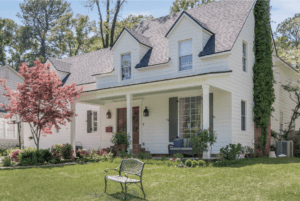 Shreveport. Face it—we all love a Cinderella story, especially when it’s something as simple and inspiring as a home renovation. We all know home renovations can be tough, stressful, and downright unpleasant. So, when the homeowners decided to remodel this home in Shreveport’s South Highlands neighborhood, they knew they needed to go big. And so they did. The goal was to meld classic taste with modern twists to enliven the space.
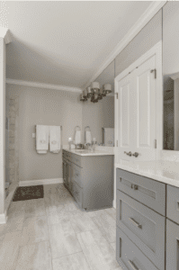
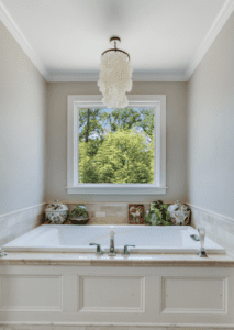
 Remodeled in 2013 by Rand Knicely Construction, this four-bedroom-four-bath residence has a new master suite, outdoor porch, and upgraded kitchen. Yes, it’s traditional, but in a kind and formal style. Simpler details were employed to keep the home from feeling heavy and too formal. The home is fresh and reflects a youthfulness for its inhabitants; therefore, the main color in the home is white—with white walls, white textures, and white cabinetry. The finished design emits a traditional, homey feel, while the neutral colors and symmetrical lines add a modern edge.
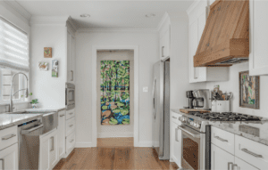
The floor is one of the many minimalistic, yet striking elements throughout this house—helping create its traditional look. There are elements of color dotted throughout the house, creating an unexpected pop of light in contrast to the stained floor.And while it looks simple at first, every layer of this home inspires a different feel. Blending updated elements, the traditional (yet transitional) style is created by balancing white, modern color palettes with natural wooden textures.
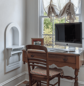
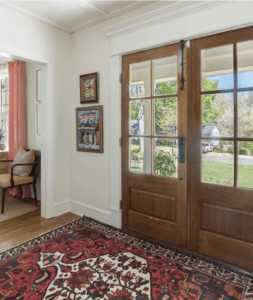 The aim was to create a space full of dimension without losing any traditional details along the way. The fun thing about the design is there’s no rules, so to speak. When it comes to proportion and sizes, there is the perfect mix of different elements of design. The interior pops with comfort and unique furnishings, thanks to inventive design work seeking a cheerful vibe with eclectic touches at every turn.
Finally, home doesn’t look “cookie-cutter” in any way. Rather, every room offers a bit of a surprise—delivering interesting decor that engages everyone who sets foot in the space. And while designers brought in a little bit of a funky flair, there’s also a lot of nostalgia. Step inside to see for yourself.
Clean Slates
This bright, white kitchen doesn’t lack any character. Cool whites and a refined, modern backsplash greet you as you enter this place, while the grey countertops pull your eyes forward. The hood serves as a focal point of the kitchen with its contrasting wood tone against the walls, and grey countertop bring in a touch of color and texture.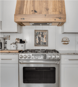
There is ample storage for serving dishes and stemware, and there is just enough space for a few added features—like a wine refrigerator. Even the hardware has a vintage feel and gives the kitchen a seamless look.
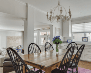
A dining table sits against the other end of the kitchen, adding a cozy, yet practical element to the monochromatic feel of the space. It offers a more casual, inviting spot for everyday family meals.
Hidden Outdoor Details
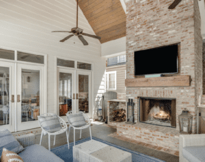
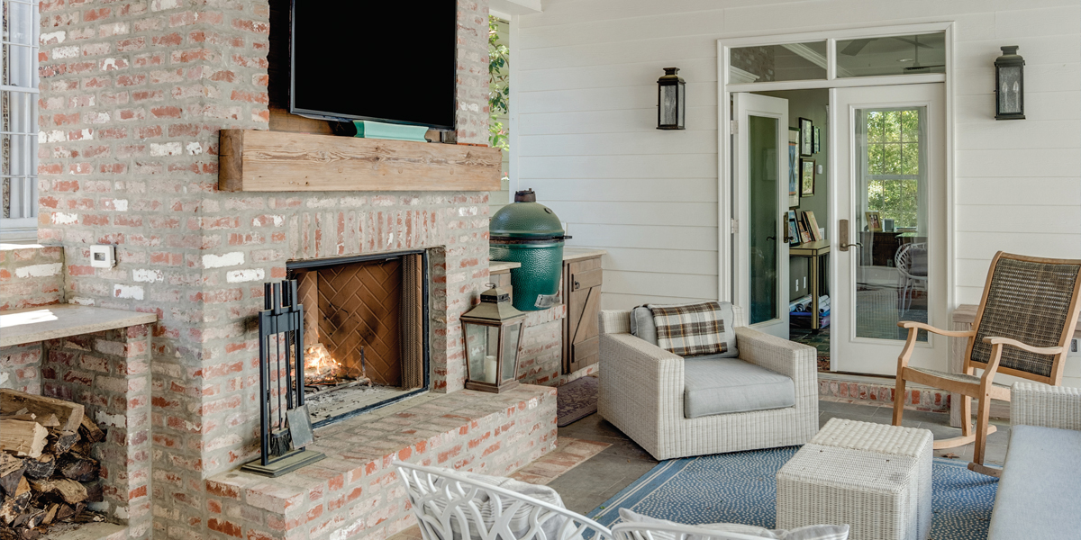
The outdoor room is full of distinctive pieces and was built to be an entertaining area. The longer you look, the more detail you’ll see. Layering design elements, unique accessories and textures were key in creating dimension and depth and is outfitted with a mix of furniture styles.
 The large brick fireplace creates a focal point, adds a heat source, and visually links the porch to the home. It has a lighthearted and celebratory feel. The sofa and chairs create the perfect spot for lounging around the fireplace, making this space usable yearround. The furniture is made with weather-resistant materials.
Furnishings with an interior influence— the rug, sofa, and wall mounted television—all look great in this space. The fireplace is flanked with handy storage for stacked wood. The distinctive, yet different chairs help mix some modern elements with traditional and create a relaxed, but inspiring, vibe.
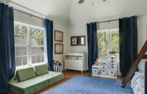
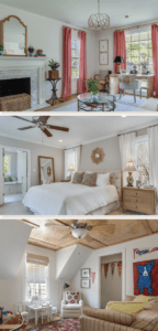
The bedrooms upstairs are perfect for lounging, playing, and, of course, sleeping. The soaring ceiling make these bedroom spaces rife with possibilities. Natural light pours into these rooms, highlighting their bright neutral colors, high vaulted ceilings, and minimal decor. And although the color scheme is simple, the wood-panel ceiling makes a statement with its abstract design, while the window treatments translate the sun perfectly into each room.
The public spaces are furnished with an eclectic mix of pieces. A shared affinity for natural fibers and textural elements injects organic warmth and interest into the decor. And while the large-scale architectural overhaul could only have been envisioned by a professional, the interior decorating was done in close cooperation with the homeowners, whose aesthetic and existing possessions drove the direction of the project.