By Adam Bailey
Magic is made when personal style and midcentury spunk come together. See how a couple’s renovation of their single-family home integrates their custom design by utilizing an abundance of natural light, art, and key midcentury features.
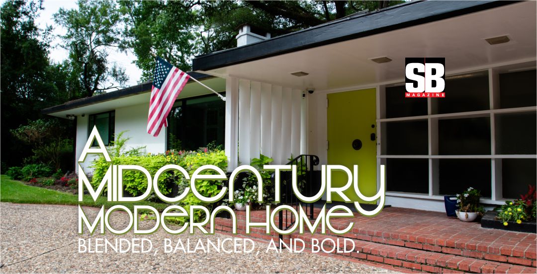
Shreveport, LA. “Around here, this is fairly unique,” admits business owners Frank and Jordan Thaxton of their recently renovated six-bedroom, five-and-a-half-bathroom, midcentury modern home in the heart of Shreveport’s Eastridge neighborhood. “It’s not built in the conventional way that most houses are.”
But that distinctive look makes this home shine even more.
Admittedly, when Frank and his wife, Jordan, started looking for their “forever home” in Shreveport, they struggled to find something that had everything both were looking for. “Either the house wasn’t right, or it needed too much work, or building something from scratch wouldn’t be cost-efficient,” says Jordan. “And, honestly, we never really considered the midcentury style,” recalls Frank, “until one night Jordan found this house.”
For Jordan, it was love at first sight. The lines, the details, and the “really big windows.” To Frank, not so much. Until he saw it was on a three-acre lot. “Yes, it needed a lot of work. But show me a three-acre lot in the heart of Shreveport? You won’t find one for sale.”
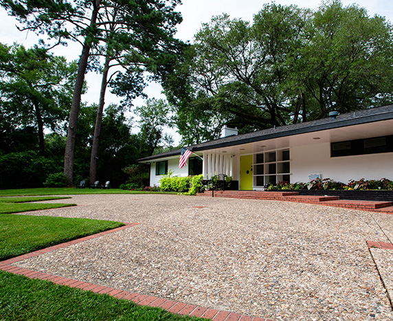
The 6,973-square-foot home was originally designed in 1949 by the iconic architect Lester Haas for the Weiss Family. It is surrounded by dense, jungle-like foliage on three sides and features the clean lines and indoor-to-outdoor transitions that midcentury homes are known and loved for.
After purchasing the home, Frank and Jordan enlisted the help of local architect Jeff Spikes of iArchitecture to help transform the house into their forever home. The goal—to balance the work of the original designer with contemporary functionality. This meant a thorough overhaul of the interior and exterior of the house.
“Getting the details right is always key to any successful home design,” says Frank. “Jeff Spikes, Chad Rosen and Chad Jeane put on paper what Jordan and I had in our heads. They had some great ideas to help restore it, respect its character, and create more connections between the inside and outside of the home.”
Once Frank and Jordan knew what they wanted to do, and the plans to do it, then came the next step. Renovation.
Preservation and Renovation
To help make sense of the relationships between the main rooms of the house—how the scale worked in their favor and render the home more livable—the Thaxton’s opened the “heart” of the home to allow natural light in. “The living room, dining room, kitchen, and den were all cut off from one another,” Frank admits. “They were connected, technically, but there was not much sharing of space. Our primary goal was to increase connections throughout these spaces—through the interior spaces and out towards the back yard.”
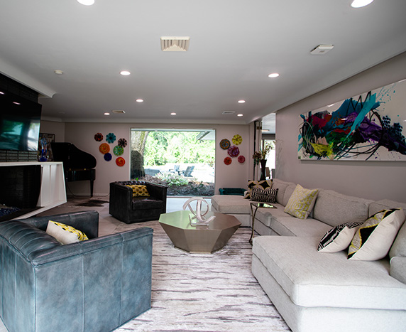
Today, these two living spaces—the living room and the den—feature two different design aesthetics and are “connected” by the dining room. The living room, a more formal gathering space, features warm tones outfitted with a large custom sectional with two chairs. It’s just one of the rooms great for entertaining. The den, the family’s favorite room, is informally called the “Little Red Fireplace Room.” And, according to Frank and Jordan, the redesign of the home centered around the vintage fireplace that was installed in the late 1960s.
“This is the room we spend most of our time in with friends and family. It is a small room with two small chairs, a couch, and our ‘little red fireplace.’ There is no television. Great conversations and family time with whoever is with us take place in that room.”
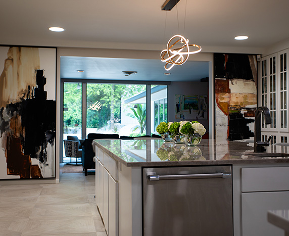
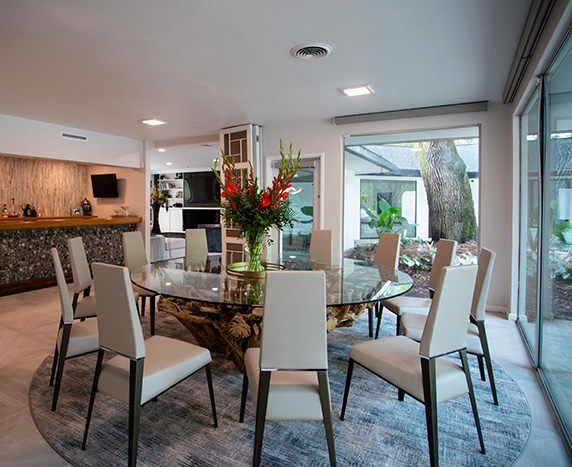
The Thaxton’s love to entertain. To suit their lifestyle, the couple decided to open part of the wall that previously separated the kitchen from the dining room. The change better connects the space to the dining room and increases the available natural light. “Now we can continue that tradition of hosting parties,” says Jordan.
Three walls were removed, and two new ones were added, along with a load-bearing beam to help “open up” the space. New, custom cabinetry, a Quartzite island, and granite perimeter countertops with a bronze brick backsplash in the kitchen reflect the home’s midcentury roots, while a commercial-grade Wolf oven and stove, as well as a Thermador refrigerator, freezer, and wine cooler offer modern convenience—especially when it comes to gathering and entertaining.
The selection of the furniture inside these spaces helps provide additional details. One of the most notable pieces is the stunning ‘cactus root’ table in the dining area. Easily sitting twelve people, it is 100 inches in diameter and weighs nearly one thousand pounds. Nearby, the ‘little red fireplace,’ coupled with the views of the backyard, perfectly balances the connection between these rooms.
When reflecting on the design and build processes of this home, one of the biggest takeaways for Frank and Jordan was how carefully the exterior space was shaped and created in relation to the interior.
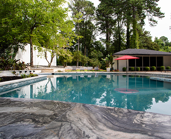
“Throughout the design process, attention to design was given equally to the interior and exterior experiences,” he notes. When we purchased the property, the original back patio was only three-by-twelve feet, so we added a pool, a courtyard, and decking.
Reimagining The Classic Design
Details like the custom kitchen cabinets, a unique light pendant, and subway tile all nod to classic midcentury design while maintaining a new and fresh air. “The original home had so many midcentury design elements—some we could save, others we could not,” the Thaxtons say.
Today, the home feels both delightfully midcentury and modern. The home’s décor strikes a balance between midcentury and treasured pieces—all personal to Frank and Jordan—and perfectly complements the original design with updated sensibilities without feeling overdone. The ambiance the couple chose for the interiors was an eclectic approach, an intermingling of bold, geometric, classical, and midcentury pieces, all assorted with modern elements (as well as a touch of the 1970s). Special attention was given to blending the texture of materials to create interest. The intention was for the environment to possess a touch of low-key, sophisticated elegance through careful editing.
“One of the things we always must be concerned about is adequate wall space to accommodate some large pieces of art we have collected over the years,” Frank notes. “The scale of the pieces and the rooms in which they were to be installed were coordinated with the furniture, taking into account color combinations and subject matter.”
The color palette was also carefully considered so that it would respectfully reflect the period’s architecture.
“We referenced vintage photos to determine the original colors of the home. This returns the home to be true to its roots,” Jordan points out. “To provide a neutral background for the art collection, we chose a warm white for the walls and medium-gray porcelain floor tiles and carpet for the interior palette.”
All the floors, tile, carpet, and light fixtures came from HomeLUXE Flooring and Lighting. The product is a house that is tastefully stylish but does not shy away from making a statement. And even though it was renovated—there is a timeless quality about it.
“Our home is one of the most important things for us. We spend most of our time here and it needed to be part of us,” Frank continues. “The furnishings include a mix of pieces that have been in both our families for generations, as well as pieces bought recently from Dallas, New Orleans, and Little Rock. No matter who comes inside this house, they all instantly enjoy the space.
In all, this home remodel was executed with historic preservation in mind, modernizing both the interior and exterior while celebrating the classic midcentury architecture. “There is no bad spot in this home,” Jordan says. “Every room reflects our design aesthetic, blends our personalities, and reminds us of how blessed we are to be its caretakers.”
The balanced approach certainly paid off! The results speak for themselves.
Frank and Jordan Thaxton would like to thank each of the following individuals and companies who supplied consulting, products, materials, as well as time and energy for this project: Architectural Design—Jeff Spikes, Chad Rosen, and Chad Jeane, iArchitecture; Plumbing Fixtures—Tiffany Warner, Coburns; Flooring and Lighting—HomeLUXE; Artwork—Vanicka Art; Glass Artwork—Ryan Pepe, Sanctuary Glass Studio; Cabinets—Tom Salzer; Assisting with Furniture Design—Myron Griffing; Landscape Installation—Chris Cassio, Cassio Property Service.

