BY ADAM BAILEY
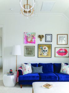
Look inside. These contemporary design elements offer new life and a modern twist to the traditional homes in Provenance— making them anything but your mother’s house!
Shreveport. Provenance is one of South Shreveport’s most unique communities. Its idea is simple—bring the traditional neighborhood back to Shreveport.
But what exactly is a traditional neighborhood development? Also known as a TND, it is a new urbanism concept where homes, commercial spaces, parks, offices, restaurants, and other conveniences are in close proximity to provide a strong sense of community and walkability. Part of “getting” what a TND is, is understanding that the architecture of the homes is part of the quality of life in the neighborhood. Therefore, living and working in Provenance means a life less ordinary.
And though Provenance is well known for its “traditional” heritage and architecture, who doesn’t love a new contemporary home for its smart design and curb appeal.
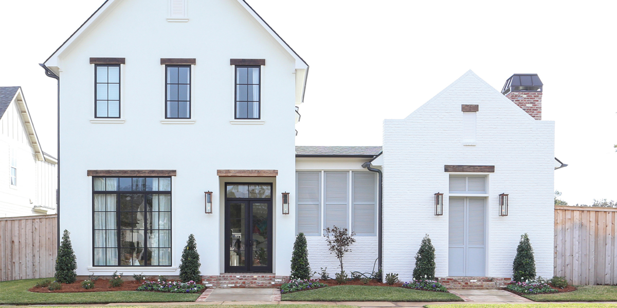
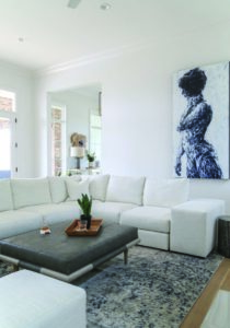
 Contemporary living adheres to a few principles that define its simple aesthetic—open-floor plans, clean lines, minimal clutter, and a neutral color palette. These elements are key to a serene and sophisticated lifestyle, and general wisdom says that when you elevate a home, you elevate your life. Today’s architects and designers continue to push the envelope and reimagine how to live by using tight angles mixed with curved surfaces, floor-to-ceiling picture windows, and innovative design. This new-construction home in Provenance is no exception.
 Alison McKenzie of Medina Interiors opted to break from tradition, using a more modern approach for her latest project. “On the whole, new construction is going more contemporary,” McKenzie admits. “My client, Jason Kirk, wanted to build a home that embraced an overall fresh feel with clean modern lines yet was still warm and welcoming. Most importantly, it had to work for his family. As a mom myself, I fully understood the importance of creating spaces that everyone could enjoy.”
Why Provenance? Aside from beauty and charm, McKenzie says Jason was clear on how the neighborhood provided a better quality of life for himself and his family. “My job was to design a home for a single dad that reflected that! I opted to embrace a relaxed Louisiana vibe with a modern twist. It’s like a breath of fresh air, and a warm hug all in one. But, most importantly, I wanted to help design a home with an open layout and soaring ceilings that contribute to a comfortable living on the inside and out.”
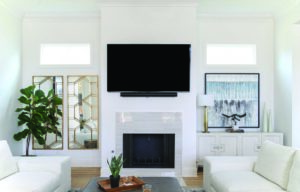
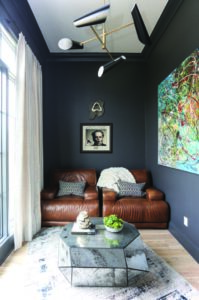
McKenzie and her team worked alongside architect Bennett Sabatier and homebuilder Matt Jenkins, who from the start really jumped on board with the overall goal and, who the designer credits, were both equally an integral part of bringing her client’s vision to life. “We truly functioned as a team, and because of that we were able to avoid any challenges along the way,” she says. “We added character through custom built-ins, geometric tile and various custom tile patterns throughout the home—all which were layered with warm textures and a soothing color palette.”
The house’s shape fits within its setting, appearing to grow from the ground itself. That means fewer hallways and tiny, wasted rooms. Its open floor plans afford more useable space—the kitchen that opens to the den and dining areas. An abundance of glass and doors—designed to open and disappear—bring the outdoors in. Here, efficiency is key.
McKenzie reemphasized it was the teamwork that made it all happen. “I am so proud of the collaboration of everyone involved on this project. The whole team was able to create a beautiful home that not only reflected the client’s personal style, but one that he can enjoy with friends and family for many years to come.”
Step inside to see all the details.
Distinctively Detailed Entry
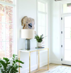
Taking advantage of modern performance with a traditional aesthetic, the entry creates a calming space that everyone can enjoy.
Given its first impression a visitor will have, the material and furnishings of this entryway set the stage for home’s overall tone and vibe. “When you walk through the front door, you are greeted with the warmth of the natural light streaming through large windows. We carried the white and black in from the exterior as our base and used a combination of boho accessories, natural textures, and live greens to infuse the residence with a sense of personality and whimsy but overall, the quiet monochromatic palette, clean lined furnishings and contemporary forms keep the ambiance hip and sleek.”
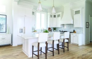
“When working on a kitchen, classic is key,” states McKenzie. She believes the forces of fashion and trends have begun to push back the pendulum towards neutral colors. Yes, whites and greys are popping up and appear in color forecasts and are seen in many fashion and furniture production runs. “If you want a space that’s truly bespoke and unique to your family while having the wide appeal and resale value—it’s in those base colors, the whites and the greys, that you should start your journey.”
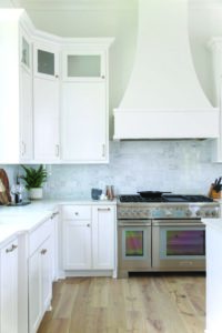
“Furthermore,” she adds, “mixing metals is the wave of the new traditional. In this kitchen, there are antique pewter faucets and fittings, stainless steel appliances, and brushed brass hardware.” She commented on how her client loves to cook so she chose top of the line Thermador appliances, custom-designed crisp white custom cabinetry, and quartz countertops for durability with light wood flooring for a natural warm feel. “We wanted an open, clean yet functional kitchen design.”
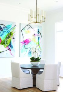
The dining room is not the place to skimp on style, and the balance of light plays a huge role throughout this space. “From the size of the tabletop—which adds just enough natural interest without being overpowering—to the size and scale of the light fixture; it was all important since we were working with tall ceilings and windows, I wanted to make sure it felt balanced.”
The round dining table suits Jason’s easy, everyday style. It’s inviting and puts everyone on equal footing since there is no hierarchy at either head of the table. The simple skirted chairs, along with the artwork, steal the show and provide warmth to this modern, trendy space.
Small bathrooms are the perfect place to take risks. Here, one can easily get inspired by wallpapers, minimalist vibes, eclectic materials, and unexpected elements. “This is one of my favorite spaces to get really creative!” says McKenzie. “It’s often overlooked in design, but it’s actually one of the most important rooms in the house. This wallpaper made this small space come alive.”
If you’re into taking risks, that’s exactly what McKenzie did—in order to keep the room masculine yet fun. “We decided to go with a floating vanity to make the room feel a little larger instead of a vanity that goes all the way to the floor.”
McKenzie’s success in designing a home that both meets Jason’s expectations and satisfies the property’s local reputation is attributed to her adherence to marrying Kirk’s lifestyle with appropriately scaled and proportioned design, respecting the cultural and historic landscape of the neighborhood and, finally, accommodating his future generations.
McKenzie further believes that, as a designer, her job to find the true essence and style of Jason Kirk, elevate it, and make his home reflect that style. “My goal is to continue to have amazing 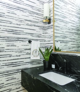 clients, such as Jason, that inspire me to create something that makes him feel excited to come home.” To McKenzie, Jason’s new home in the beautiful Provenance neighborhood was an interior designer’s dream job. After discussing all of Jason’s needs and dreams, she was given free reign.
 The end result speaks for itself.
Products, materials, and suppliers include:
Custom-Bilt Cabinet and Supply
House of Carpets & Lighting
Jenkins Construction
Medina Interiors Morehead Pools
Sabatier Architecture
Sheppard’s Countertops
Sound Minds
Thermador


